Whup! is a magazine focusing on professional fighters and the cultures of different types of fighting. This project consisted of three phases: development of a wordmark, a publication design and a table of contents. This project was done over a four month period.
Whup! Magazine
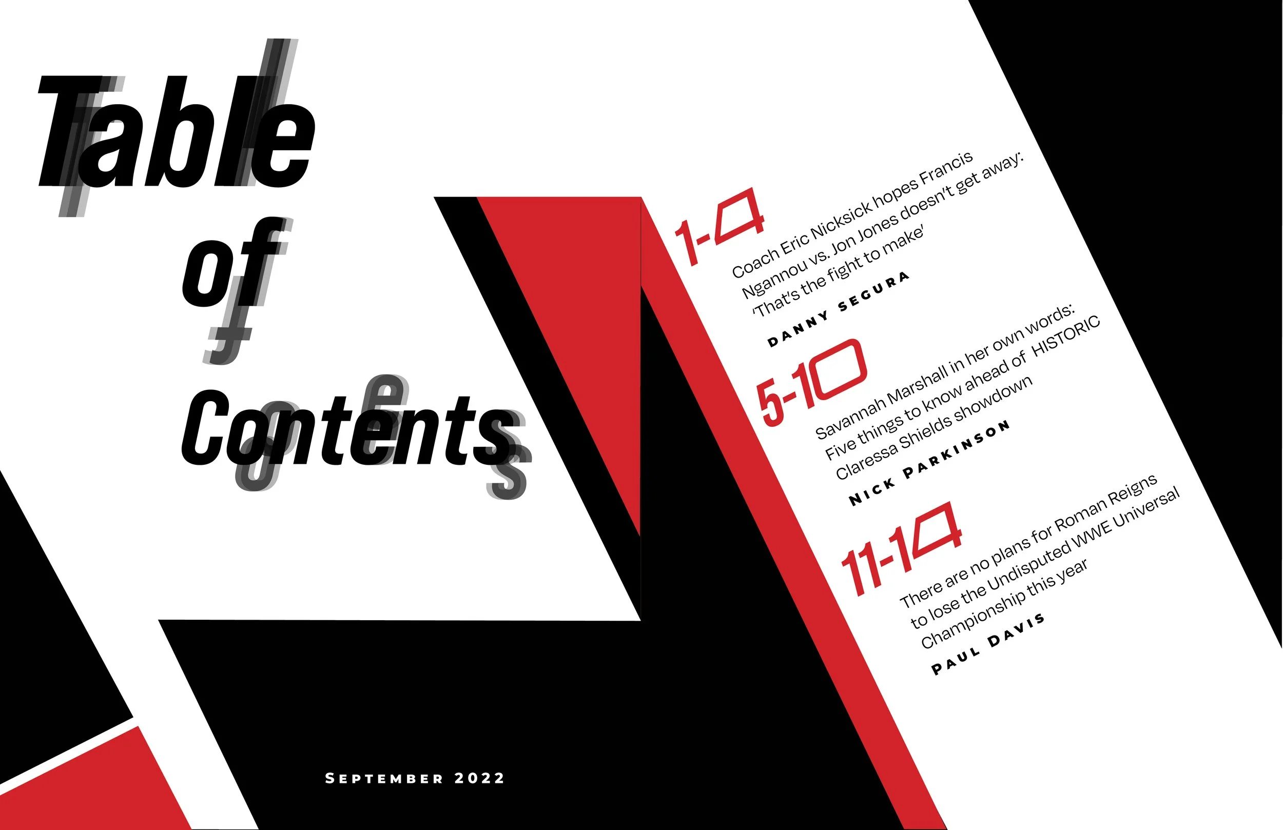
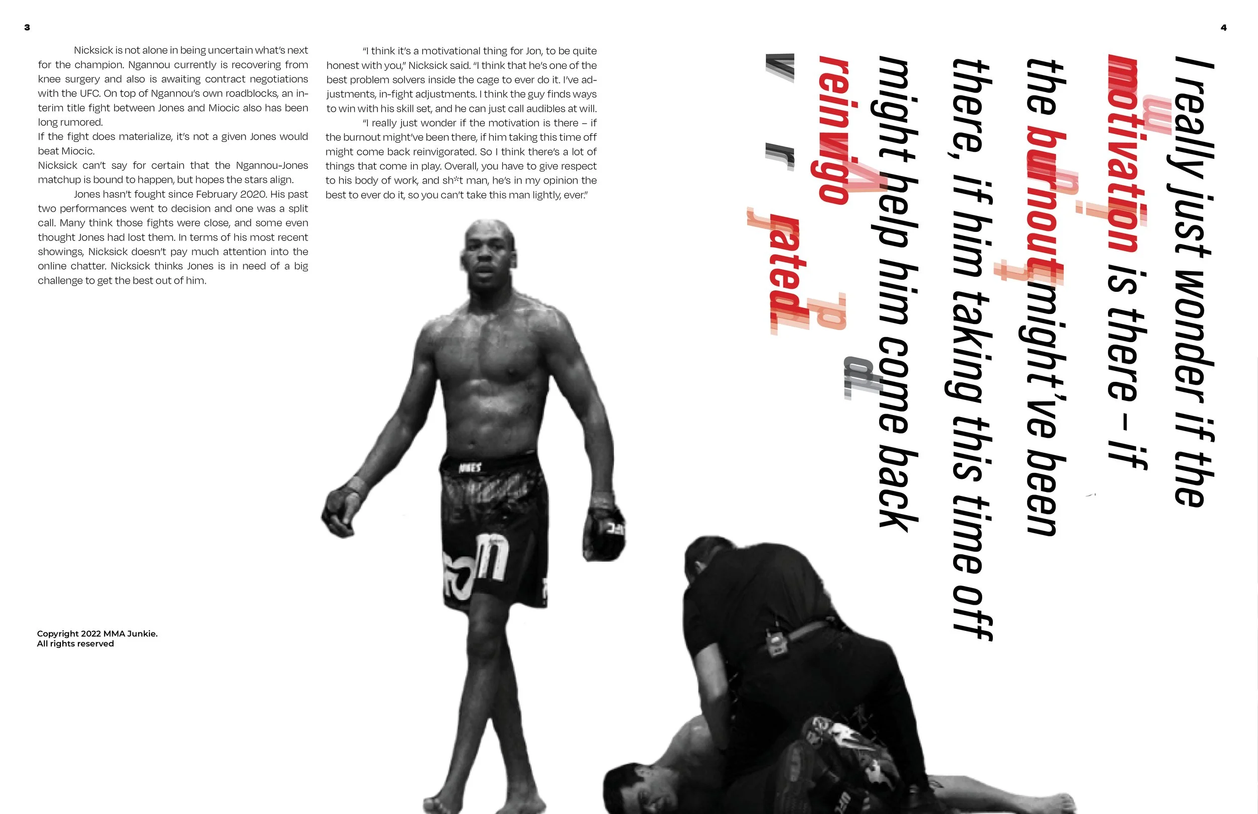
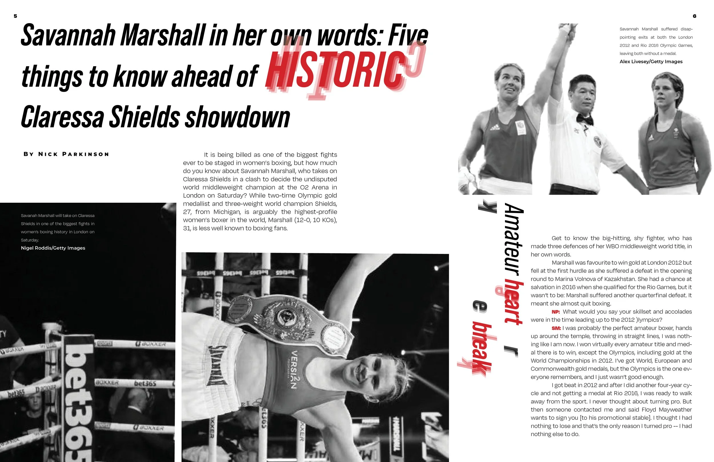
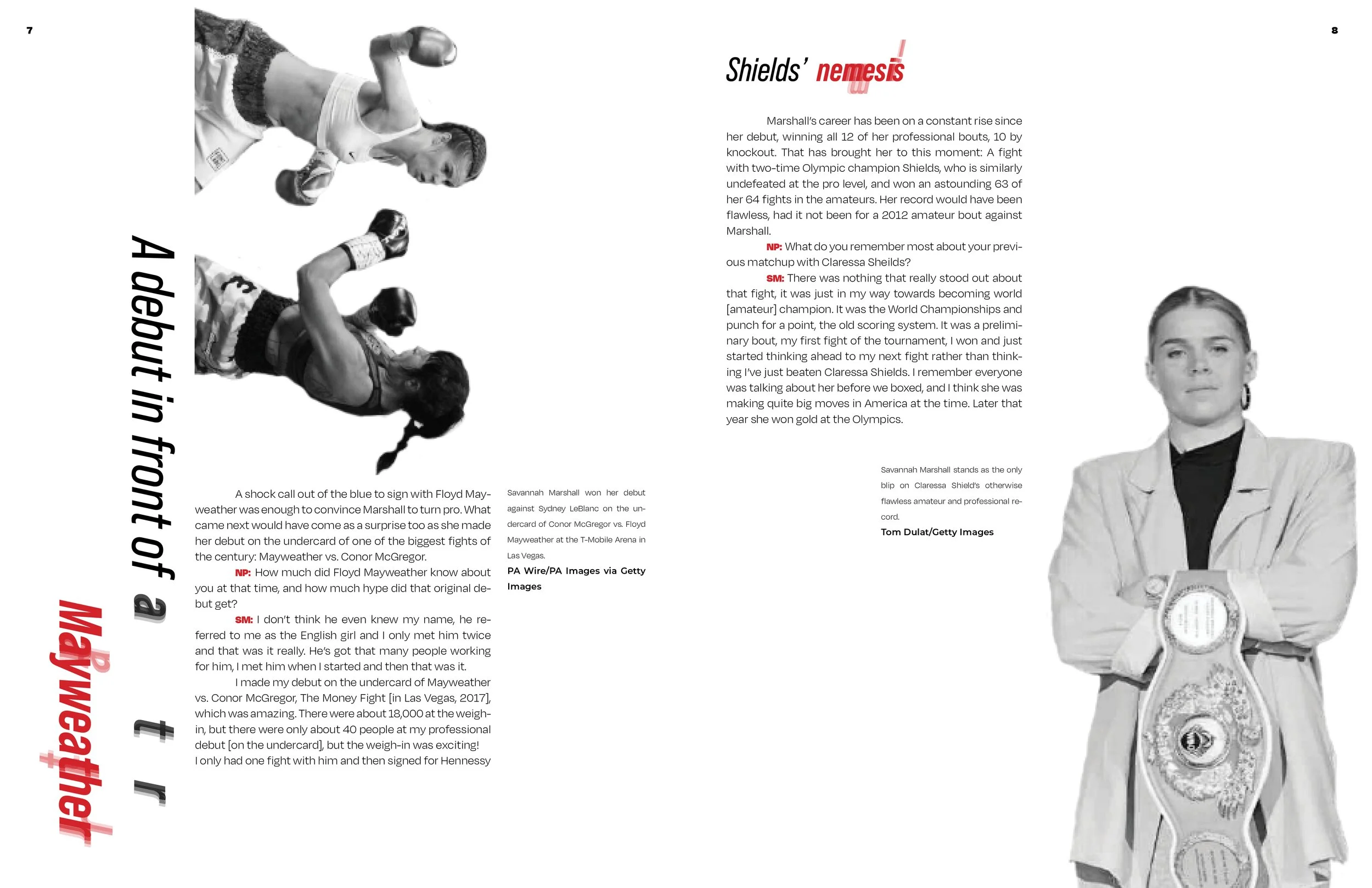
The color pallet of this assignment varied throughout the process but it originally consisted of black, white, grey and red. The effect of the text was inspired by the motion blur and floaters that one gets when they get punched in the head. Sharp angles using these colors were incorporated with El Lissitzky’s compositions in mind.
Inspiration
Two new iterations were made every week for every section of the project. The wordmark is all caps Degular Extrabold Italic, and the lettering was trimmed to signify sharpness. The table of contents incorporated the exclamation point as a design element. The cover originally had a grey background with white text and white gradients.
Process
The trims on the wordmark are all at a 29 degree angle and it was placed on the cover at a 90 degree angle. The photos were chopped to isolate the eyes. The final spreads used high res black and white photos as well as red text to signify importance. The table of contents includes the angular black elements of the front cover.


